A house is never finished and decorating is an ongoing process. I’m sure you’ve heard those words before, and they ring truer than ever for me now! When we moved here in November of last year, many of the things we brought along were items I’d bought when I first moved out of the house at age 18. So much has changed since then! I’m 25 now and my style has shifted towards a more calm and simple aesthetic a lot. My very first own room was decorated with rustic items in dark wood, floral prints and green, and even though I still like that vibe I’ve noticed I’d rather have cleaner looking, brighter things in my home now. Mostly I just feel like as perfect as my oldest things were for my first apartment, they look kind of out of place in this one. I’ve slowly been replacing them with different things, either re-purposing the old items in a less prominent place in the house or putting them away in our storage until I find a use for them again.
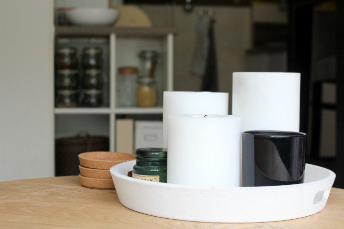
There are also some places around the house that have been a bit of an eyesore since the beginning, as I haven’t yet been able to style them in a way I truly like. During a spark of inspiration earlier this week, I decided to finally tackle them and make them more to my liking. I started with the biggest problem area: the open shelving between the living room and the kitchen.
Before
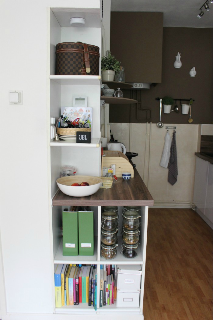
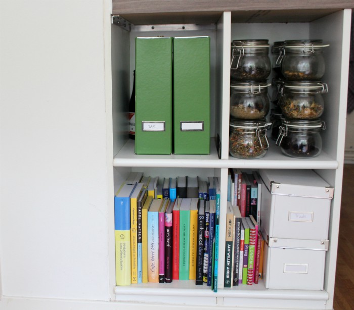
Here they are. I remember back during Vlogmas right after the move, in one of my vlogs I mentioned considering closing the bottom shelves behind a curtain or some door of sorts. We never got around to that but I was very unhappy with the way this looked. Much too colourful and overstuffed, I feel like it made the whole room look more cluttered. The top shelves weren’t as bad. I have re-done those a few times already and it gets better every time, although I still feel like they could be much nicer.
Of course considering the size of our apartment, we can’t really afford to have any storage space be just for display and serve no function. All the boxes, magazine holders and baskets you see above are in use, so I had to figure out a way to make the shelves look prettier without losing their function. By moving some things around in the office and the hallway closet I was able to free up space to move the books elsewhere, which made a huge difference already.
After
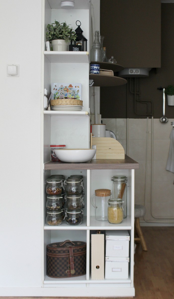
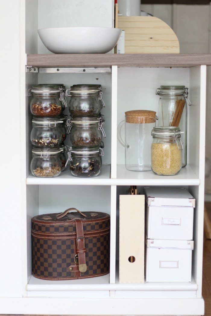
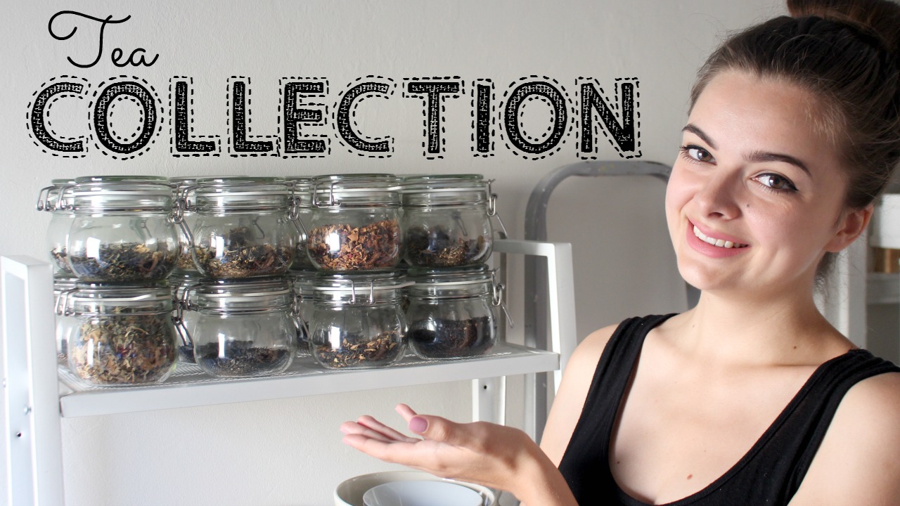
What a difference! I feel like removing all the brightly coloured books and the green magazine holders makes the space look much more mature and calm. I put the green magazine holders to use in various cabinets around the house, and replaced them with these wooden ones on display. Not only do these look nicer, they are much sturdier than the paper ones as well. The one shelf that only contains glass jars makes the shelf full of jars of tea beside it look more acceptable and in its place, in my opinion, where it just looked busy before. The new jars have found a function in holding dry goods so they’re not taking up space just to be pretty (although I certainly think they are). The checkered box, which holds my eyewear, is much better suited to this spot as well. I feel like it was too large and heavy to be on a top shelf, in my opinion the plant and lantern look much better there.
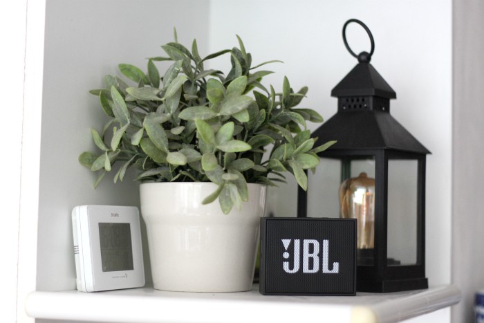
They also provide a nice backdrop for our little speaker, which was placed on this shelf temporarily but ended up always being there. Now it has an actual home, in the place where it’s most often used, that it fits in nicely.
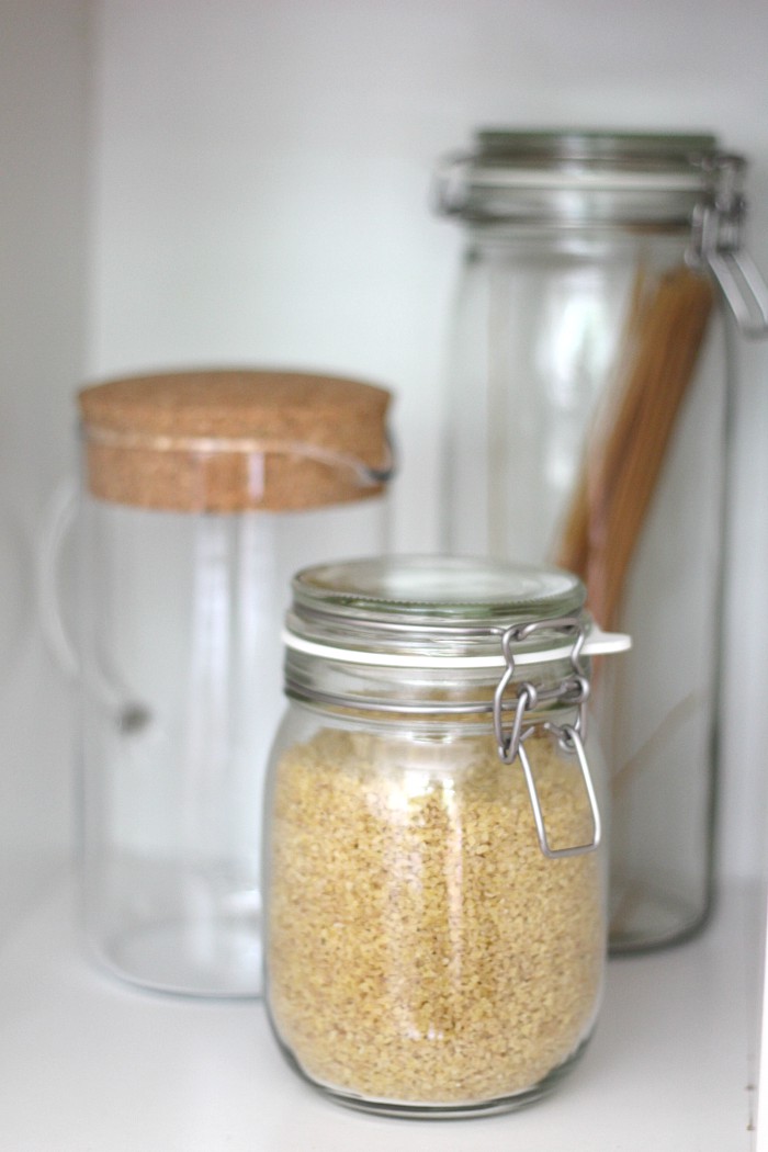
I’m in love with these large jars! This house is the biggest one I’ve lived in to date, and when I moved my things in here everything suddenly seemed so small. The space really called for some large accessories and these jars do the job perfectly. They’re from the same line as the smaller, round jars I use to store my loose leaf teas in, so they tie everything together nicely. I’m also really in love with the look of the cork-top pitcher, which I plan to use to brew coffee in when we have guests over.
Now, another area in the home I wasn’t fully happy with is the bookshelf.
Before
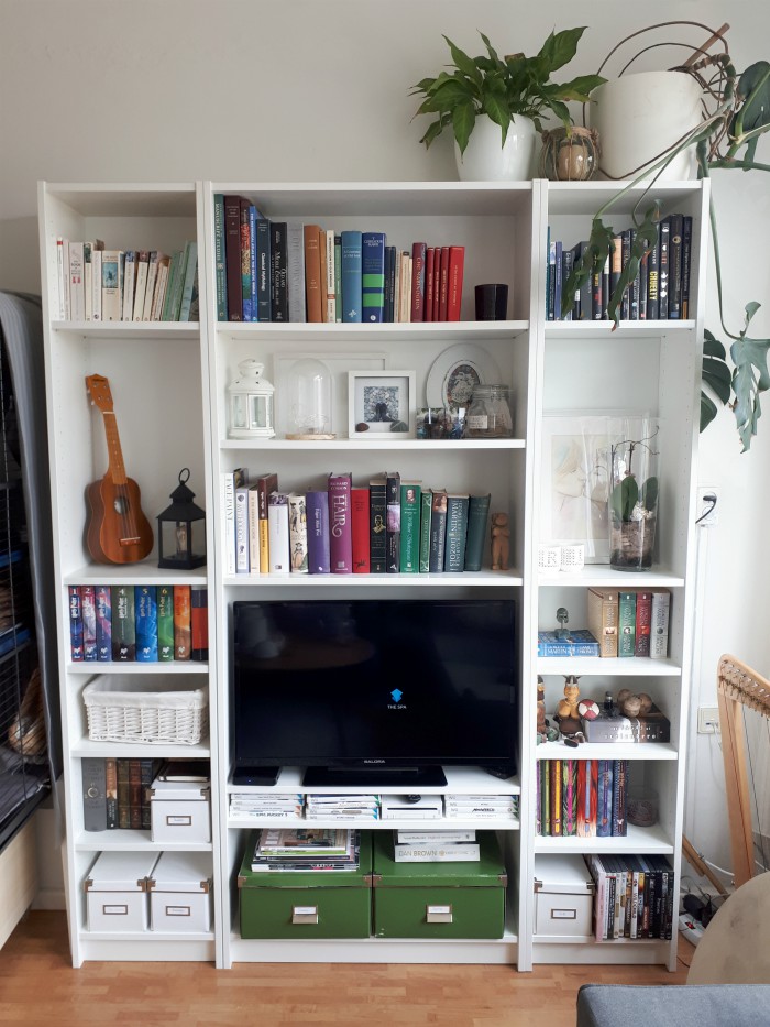
When talking about the other shelves, I mentioned them looking cluttered from all the colourful books. I feel the same way here! Even arranged by colour and size, the books still draw a lot of attention. Now I must say that this is the selection of books that are dearest to us and/or the prettiest, or simply put the ones we’d like to have on display. We happen to have many books and I don’t think there’s a way around them looking a bit cluttered, if we do want to keep them on display. I’ve noticed on Pinterest I’m really drawn to the look of flipping all books that aren’t a neutral colour so that the spine is facing back and you can only see the paper. It’s a wonderfully aesthetic look, but I can’t help but feel it’s kind of… disrespectful to the books, if you get what I mean? Especially these ones, which we’ve chosen to proudly display. Something I might consider doing is to dress the colourful ones with a hand-made custom sleeve, with the title written beautifully on the spine. I haven’t gotten around to that yet though and it might take a while before I do if I ever, so until then I’ve decided to re-arrange the whole thing once again.
After
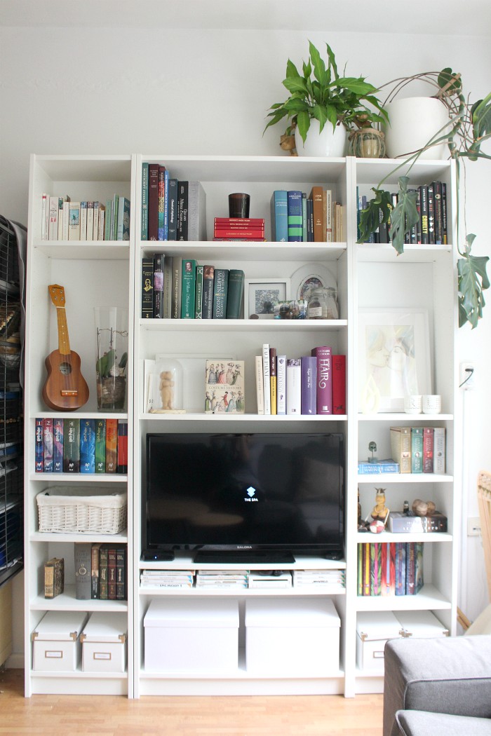
The first thing I did was to switch out the green boxes, which were slightly too wide anyway, for white ones. These are much more subtle and I feel like that helps a lot. I’ve also added another white box to the lower shelf on the right and removed the DVDs that were there, so that the bottom is now uniform and symmetrical. I’ve re-arranged the books in the center shelf so that there aren’t shelves made up of only books or only decorations, and to break up the lighter and darker coloured books. I’ve also laid a few books down horizontally, or propped them up face-forward, to provide a bit more variation.
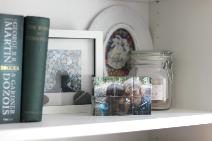
I try to keep the decorations in the bookshelves light in both colour and feeling. Not sure how succesfull I’ve been in that, but hey, I tried.
Another little thing I’ve been wanting to do for a while, is tackle the couch.
Before
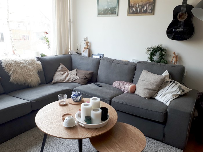
There isn’t much wrong with the way it is now, but I did feel like the cushions I had didn’t fit the new house. The cushions are some of the items I’ve had since 2011 and most of them have seen their best time. I bought them when I didn’t have a couch and needed to transform my bed into a sitting area every day, so I got lots of cushions to make that possible. It worked wonderfully and it was one of the elements of my room I loved the most, but here all the little cushions with different prints and textures are just a bit too much. Not to mention the rats had gotten to them and chewed the buttons off or made holes in most. It was time to replace them!
After

I decided to reduce the amount of decorative pillows from seven to just four and the log, which I can’t bear to part with just yet. I also took away some of the decorations on the coffee table so that it’s not as crowded. We switched the large and small table around a few months back already, but that’s another change from the before photo.
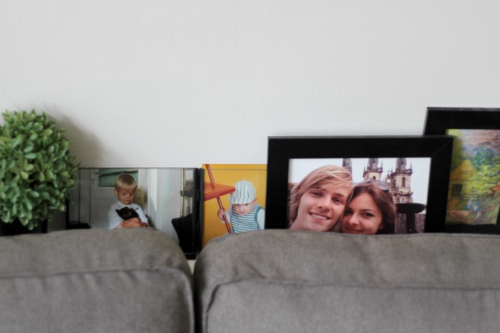
The shelf behind the sofa also needed a little re-styling, mostly for practical reasons. The rats have made a habit of exploring it during their free-roaming time, so I had to remove anything that could be dangerous to them or too easily ruined by them. Mostly the jasmine plant which they’d try to eat, but also some wooden decorations. All in all I think it looks cleaner this way, so it’s a positive change in my book.
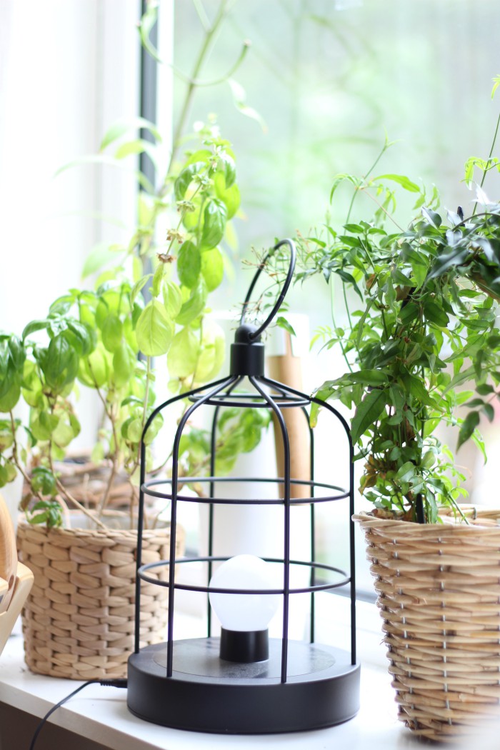
I moved the plant to this green corner on the windowsill. My little indoor garden! I absolutely love the way this looks with the pots made of natural materials and the lantern. Behind there you can also see our new watering can. I finally got around to replacing the old, mouldy plastic one with a beautiful steel and wood one which will hopefully last a long time.
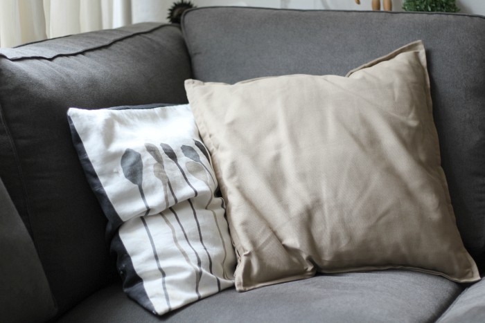
Only one of the cushions on the sofa has a print now, which is wonderful. This room doesn’t need printed cushions, there’s enough going on as it is and I feel like a neutral base is much better suited.
I’m so happy with this re-styling! It took very little effort, all I really needed was to see the light on where I wanted to go with the room and how to get there. The thing I love the most is the new look of the kitchen shelves, I can’t help but smile every time I look over there now. What a difference with before, when all I could do was think about ways to hide them! Now all there’s left to do in this room is to figure out a way to make the bookshelf look nicer. If you have any ideas, I’d love to hear! Just know that we’d like to keep these books on display, and I absolutely refuse to break up series, haha :)



I like that there are less colors in a book shelf. A new way to decorate. It is also possible to remove the paper around the books, and suddenly you get new colors. Maybe hide some colors away from the others.☺️ I like grey tones. It looks good together with silver. Maybe darker grey and lighter grey if your sofa is grey. Some yellow can fresh up a bit also if you like to fresh up a bit.
I really like the way you decorate. I think you want less colors. Pretty colors you choose. I would use light grey, white and beige colour tones myself to get it lighter in the room in contrast to your sofa. Or light colour from your sofa colour. Curtain colour same as wall colour is very well. Same colors in the room in different tones are a new way now to go. ☺️
I am the absolute opposite >_<
I might try to start clean, but I just end up having everything colorful from floor to ceiling. It's just how I am, I guess! But I do try not to hoard stuff and I do my best to give everything its home.
Your space looks very sweet, tho! I am not a big fan of grey, but you still make it feel super cozy with all the plants and books and tea ^_^ You make it look harmonious. :D
The TV unit is definitely your biggest problem! Something I do is if the shelf is deep enough I would place books behind books. But I think DIY book sleeves is the way to go. Plus you can make a video/post about the process and how too.
Also having an item like the one linked to display books or as I use it for the currently reading. Would really look nice. It will also add a pop of colour to the shelf.
https://www.kmart.com.au/product/acacia-tablet–book-stand/1571389
Everything is looking so good. I have hundreds of books and lots of shelving, and I am the same way in that I won’t break up a series either haha! I totally understand!! I am a neat-freak, so I like to organize my books mostly by genre, and then by alphabetical author within the genre, otherwise I’d never be able to find a particular book. I like to have lots of colors and sizes all mish-mashed together. I just love the look of books. But, if you do want to streamline it, your idea of doing a neutral cover on your books is a good one. You could get neutral paper and fold it over your books to make simple covers and streamline the space. I personally would not write or put anything on the spine. I think it looks great with just all of the same color side-by-side, all organized and streamlined. It may not be super-practical for finding books, but it will look nice. You did a great job with your bins on the bottom. That is what I would do too. Anything that isn’t “display-worthy” I would put in some attractive bins that are all the same to streamline that look too. Happy decorating!
You are inspiring me to get my act in gear and spruce up a bit! I like the changes.