A few weeks back, our larger coffee table collapsed and needed to be replaced. By some strange play of fate, I had been to IKEA with a friend and bought a new coffee table that very same day. We put the old table away, assembled the new one, and there it was. Quite beautiful and fitting with the rest of the house, but bare. I put the tray of candles on that we had on our previous coffee table, and it looked completely out of place. The style of the old decorations was so different, there was no way I could make them work any more. So I gave the tray a new home on the dinner table and the coffee table went back to being bare. It definitely needed a bit of styling though and given that this is the first time I’ve owned a glass, two-layer coffee table, I was at a bit of a loss as to what to do at first. As always when in a bit of a styling pickle, I turned to Pinterest for inspiration. Taste is a very personal matter, of course, but I thought today I’d share what I found and how I ended up decorating our new glass coffee table.
The Basics
There seem to be a few basic rules when it comes to coffee table styling (or any styling, for that matter). You’re free to disregard these at will of course, but I feel like they provide a good starting point.
Odd Numbers
I’m going to start with a bit of a controversial one straight away as I know there are two types of people: those who prefer odd numbers, and those who prefer even numbers. When it comes to visuals, I’m definitely one of the former. A group of three or five items is likely to look good or right to me, whereas a group of two or four items is bound to look wrong. In my experience, grouping items together in odd numbers gives that look of accidental perfection- as if things just happened to end up there and look fabulous. Items in pairs tend to look over-thought and over-styled to me. I suggest you try out both: grouping items together in odd and even numbers, and seeing which feels better to you. I promise it makes a difference!
Variations In Height
Another thing to consider when grouping items together, is their hight. A collection of objects will look more aesthetically pleasing if all the items are of a different hight, especially when it’s a small group, and especially especially if they’re right next to each other. When it comes to coffee tables though, be careful not to decorate with anything so high that it obstructs the view when you’re sitting down.
Form vs. Function
Another personal point here, but I’m not a big fan of cluttering up a useful surface (such as a coffee table) with items that have no function. It’s ok to have a few items that are just pretty, but I personally really dislike a coffee table that’s so full of stacks of pretty books and geometrically shaped decorational objects that you can’t put your cup of tea down. I’m much more drawn to decorating with items that are pretty, but can also be used such as, for example, nice coasters or a box that holds remote controls.
Cohesion
This is pretty straight forward but something I still wanted to mention: make sure all the decorations go together, and fit the style of the room they’re in. In the end the coffee table should blend in to the space, and not be its own little island (even though it may feel like it while you’re focussed on styling it). Stick with the colours, textures and style you already have in the room.
360 View
A coffee table is one of the few pieces in a room that you’ll be able to see from all sides, so make sure whatever you decorate it with looks good from all angles. For exaple: a candle or plant looks nice from all sides, whereas you wouldn’t want to be looking at the back of a picture frame.
Inspiration
I’ve gathered a few of my favourite images from Pinterest to show you what kind of style I’m going for.
I love pretty much everything about this setup, and I feel like it could’ve come straight out of our home. All the individual pieces are super pretty, as is the combination of them all together. The collection gives a really nice, calm vibe, has a bunch of different textures and a colour palette I’m drawn to.
Similarly, this setup also has the combination of textures and colours that gives that certain vibe I try to create in my home. A small green plant seems like a must to me on a coffee table, it’s something that keeps occuring throughout all of my inspiration photos.
This setup has similar colours and textures again, but is even more minimal than the previous ones. I feel like this could work well on our black and glass coffee table.
In contrast, this image has a slightly more rustic feel, which I like very much but don’t think would work well with our coffee table. The tray of candles I had on the old coffee table was a bit more rustic in style and it didn’t go with the modern feel of the coffee table at all. Still, a nice inspiration photo! I like the fresh flowers.
Be still, my beating heart. If I could pluck this straight out of my computer screen I would. I love everything about this, and I’m sure I could make it work, if not on the coffee table then somewhere else in the house. I’d find a way, haha!
This is a little bit less my style, but it shows the workings of a two tier coffee table nicely. It’s important to balance the two tiers out, so when one is full and busy, the other needs to be more empty and minimal. I do think that this tabletop is still way too full though, and let’s not mention that wooden horse at all, haha!
What We Went With
Having a glass top and a second layer to a coffee table complicates things a little, as the decorations need to not only look good on their separate tiers, but work together as well. I ended up going with pretty simple decor that looks nice and fits with the style of our living room as well as the function we have in mind for the coffee table.
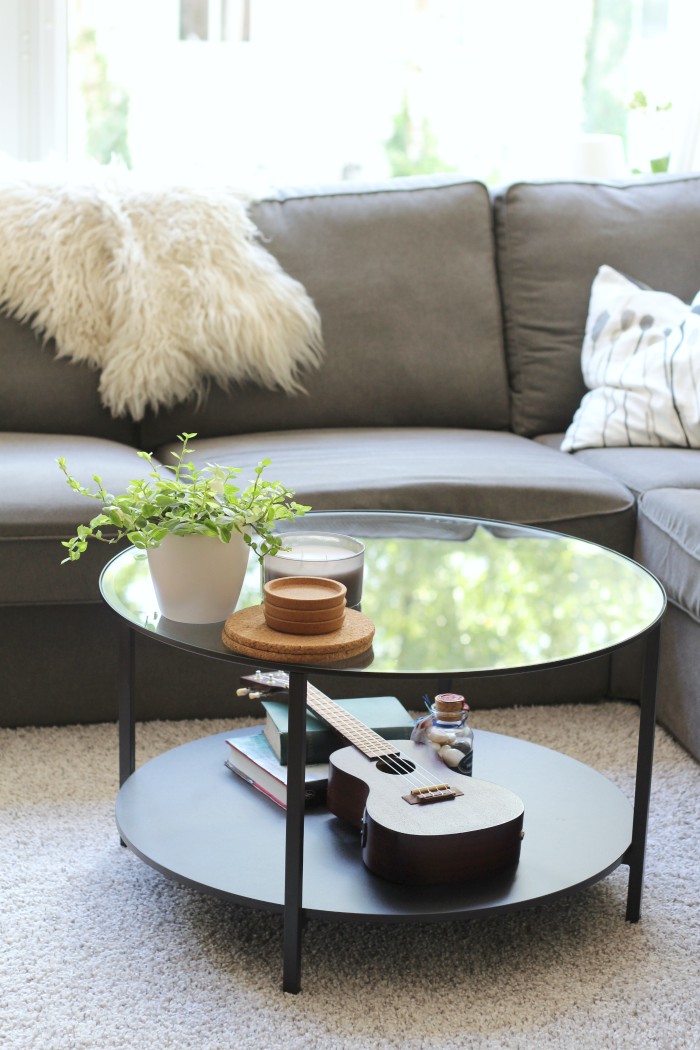
Alright, it’s obvious I went with a few coffee table styling clichés here. Stack of books, plant, candle… Then again, when you’re completely clueless, a cliché can be a good place to start. I decided to leave the tabletop quite empty, with just a plant, a candle and a stack of coasters on the surface. The coasters have an obvious function (they’re a must combined with a glass table), and all three items are quite minimal so the top doesn’t look too cluttered combined with everything that’s going on underneath.
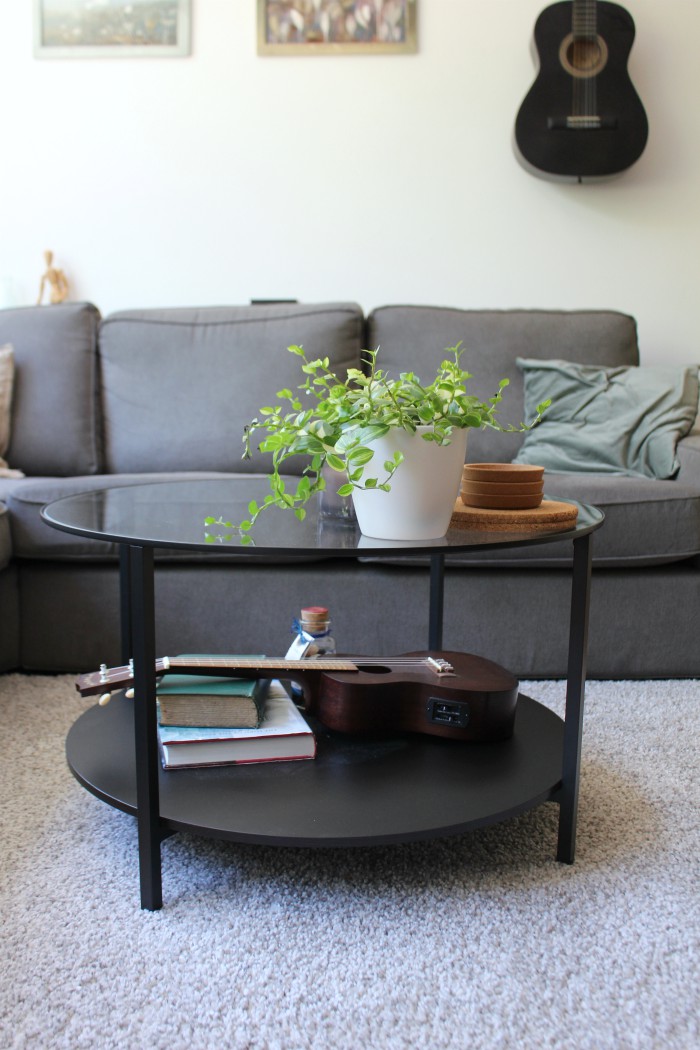
On the bottom tier I went with two stacked books (the Return of the King illustrated by Alan Lee and the Works of Lord Tennyson), Robbert’s ukelele that he uses a lot, and a jar of candy pebbles my parents brought me as a souvenir from Prague. They’re all items that are special to us in some way, and they fill the space nicely without being overly cluttered. I hope. Again, a matter of taste, haha!
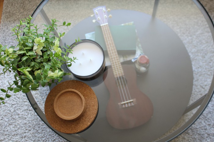
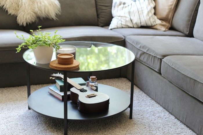
All the decorations look nice from all angles, they don’t compromise the functionality of the coffee table (in fact it’s been promoted to function as a ukelele stand as well), they work nicely together and they fit into the space perfectly. Knowing myself I’ll probably change everything up again before long, but for now I’m very happy with the way this looks.
What do you currently have on your coffee table?




Looks lovely! Perfectly suits the space and reflects your personality. As an aside, I’m new to your site/channel and I have a question about the brown striped throw you sometimes use on your sofa…where did you find it? I’ve been looking for something similar for some time now.
Thanks! I’ve had that throw for many year so I’m not entirely sure, but I believe I got it at Xenos.